This week's Creative Tuesdays theme is Blog Icon/Button. Well, I have to admit, I have no idea how to go about making a button, but, in a sense, well at least very relatable, this seems to fall into the realm of Logo Design, so that's how I chose to go.
I've been a fan of corporate logos for sometime. Even as a Kid I always loved seeing a really good one, and have dabbled with creating my own over the years as well. In fact, I used to make up sports teams names and try doing their logos as well. I have a post of some of these that I posted back a while, in case anyone wanted to check them out.
Unfortunately, when i get outside the world of abstract, my artistic ability is rather limited. But I'm trying here and there, and I have to say I think I'm getting better at the more traditional styles, and I have Creative Tuesdays as a main reason for the progress, as while you can pretty much incorporate abstract into anything, but many of the themes It gives you a great opportunity to at least attempt something outside your comfort zone, and like many of the times, I didn't like what I was getting so I went back to the abstract, but the old adage, practice makes perfect rings oh, so true.
For this theme, I used the inverted C with a triangle in the center. I've used this logo numerous times, for a variety of things, over the years, and it's kind of stuck with me. So, for this first design here, I did one by itself and then in the center I did an expanded design featuring it in various poses, so to speak, and then in the bottom I played with a logo utilizing the Sqwerm blog name. It's a lot of fun, and a great theme this week. Can't wait to see all those submitted.
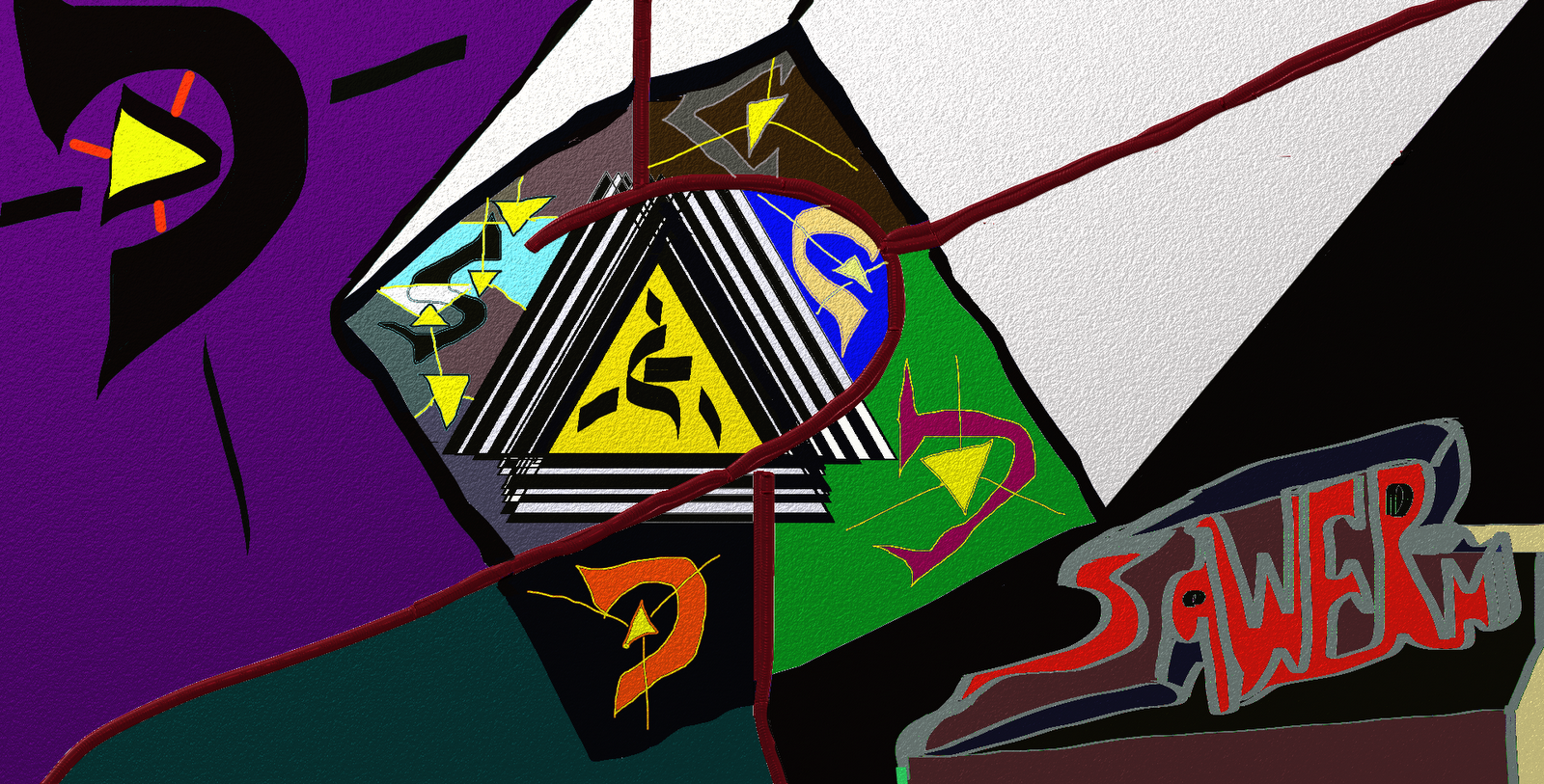
And, just for fun, while I had the design fresh on the screen, I pulled out my faithful friend, the knife and played around with the logos, and in the process, created an abstract piece.

Head on over to Creative Tuesdays, check out all the pieces that have been linked up, and if you're up for it, read over the rules, create your own and share it with the community.
Oh Fred, I can see your love for logo's in both pieces... I have always been facinated with logos too. I can see have some Graphic talent in your Art Bag too. My son would like your work.
ReplyDeleteYour logo represents your art here at Sqwerm perfectly and that's exactly what a logo should do! I may even like the second one better!
ReplyDeleteNow, I wonder what one of my dainty little birds would look like after the "Fred" treatment?! hahaha.
thanks Betsy. I actually like the second version a lot better myself. Yeah, representation is big in Logo design, that's neat you can associate these with my work, that's a great comment to hear. As for your little birds, hmm…Not sure how I'd be able to do that, but the birds probably wouldn't be all to pleased with the experience lol
DeleteOh, I don't know. The birds might like being a little more hip and cutting edge! lol...a little less sweet and a little more abstract!
DeleteBetsy is totally right here. TY for taking the time exploring it to such a degree. No need to NOT be abstract here as you're good at that style in particular. It just needs to be you. You accomplished that and now you only need to decide which one! now, why the inverted c?
ReplyDeleteTY for your comments on CT helping along the way--SO GLAD you've stuck with us! :)
BTw, I like seeing "Squirm" shown in a graphic format esp. :)
thanks. If I had to pick just one part, I'd go with the abstract piece, but the whole thing in itself might be a little too much for a button, so I'd most likely take the orange inverted c centered at bottom. You know, the C symbol is just something I doodled one time when i was younger, I believe it originated when I used to make up, or try to, fake sports team names and logos, but can't remember for sure why or how exactly the c came about, but it stuck, have been doodling it ever since. Oh, your welcome, CT is really fun and everyone comes up with some really neat artwork and are extremely friendly as well. Yeah, you know, the sqwerm logo does look kind of neat in that abstract, but my mother would kill me if I used it, as she'd instantly say it looks like it's dripping blood lol
Deleteyou know I think the 2nd abstract piece sums you up perfectly...they are both great interpretations!
ReplyDeleteLove how you embodied the bright colors and free design. I also admit that I like the second one a whole lot!!
ReplyDeleteVery powerful! I love the colours and think I like the second version more.
ReplyDeleteYou work the knife to great effect. The second definitely feels more alive -- the dark reds resemble people, some of colors seem to flame, there within seems to have stars that sparkle. View at a distance, the middle bit with the white trailing back like that, it looks like a comet about to hit.
ReplyDelete